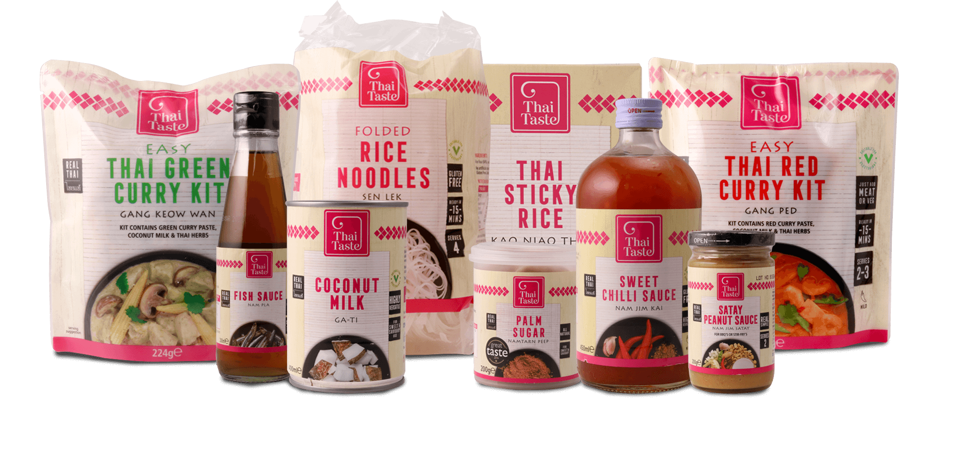
Inspired 20 years ago by the popularity of long-distance travel and the taste for exotic food, the award-winning company has gone from strength to strength and needed a new brand and eye-catching packaging to make it stand out in the crowd.
APPEALING TO BUSY CONSUMERS
The existing packaging was tired, appeared corporate, and was out of place within the market. The new identity had to reflect the heritage and authenticity of the products and to help give them appeal to busy consumers.
After a lot of research and a considerable amount of product sampling, we felt we could make a start with some design concepts. We needed to consider a number of factors, such as shape, colour, and typography.
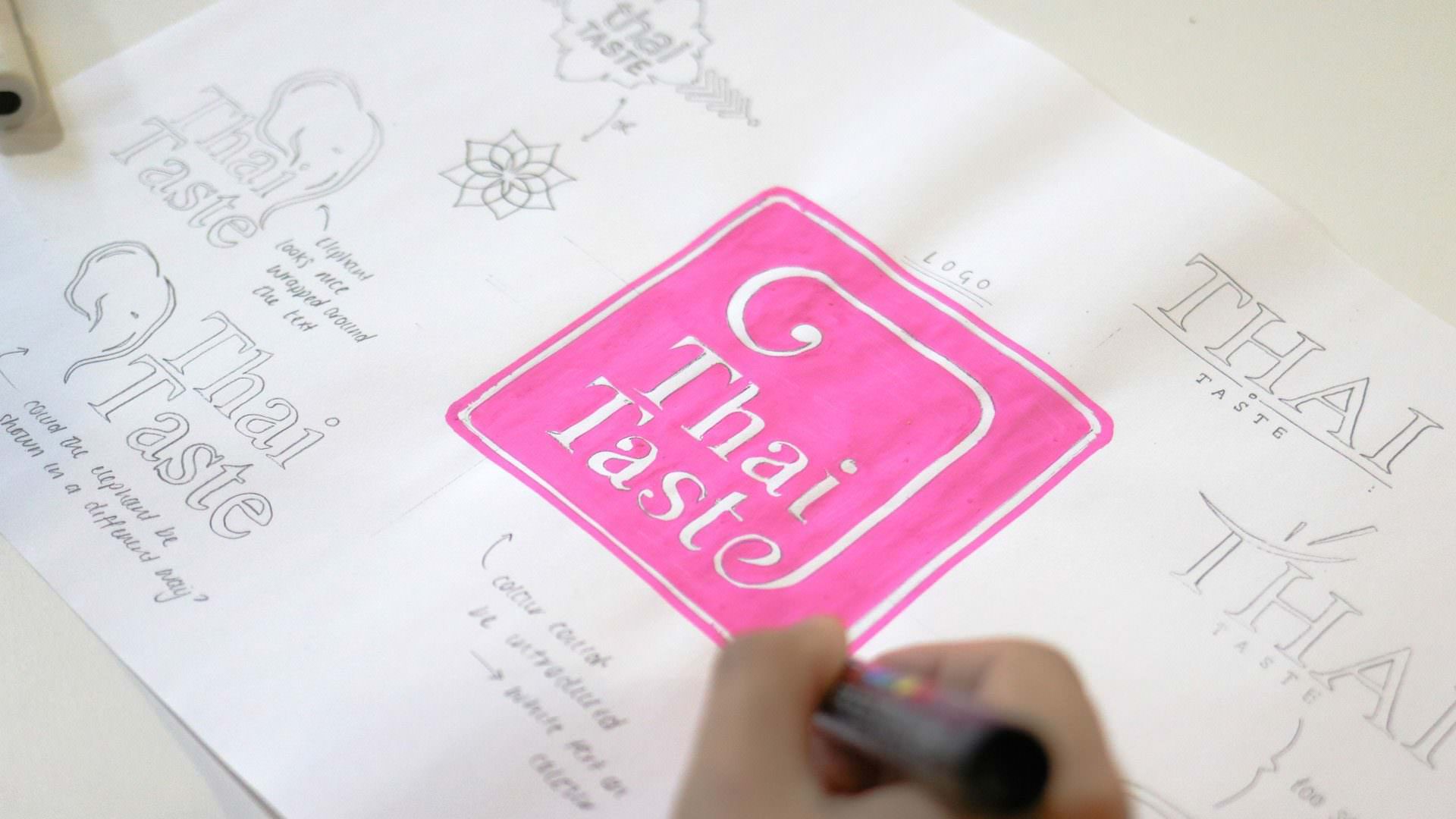
EMPHASSISNG NATIONAL HERITAGE
To bring the Thai heritage to the forefront of the brand, we decided to use Thailand’s national symbol, an Elephant, in a subtle way within the logo.
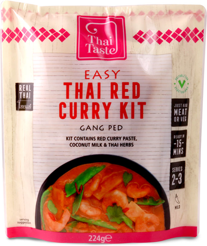
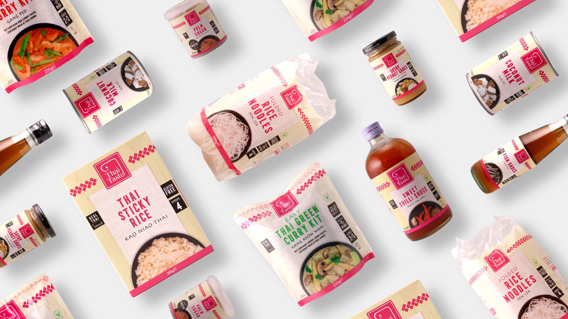
We made the colour of the packaging lighter to increase standout and incorporated photographic elements into the design to make it clearer to the consumer as to what each product should be used for.
After we had finalised the design, we came up with and put together brand guidelines, and developed the style across the range.
This was a huge and exciting project for us to work on, as in total it involved creating more than 55 artworks for packaging.
![]()
PRODUCT IS ESTABLISHED NATIONWIDE
The Thai Taste range is now well established in leading UK supermarkets and selected independent retailers nationwide.
The team have offered unwavering and timely support way beyond the initial quotation. This is how we work as a company and it’s really refreshing to work alongside another organisation that values customer relationships as much as we do.