BRINGING THE OUTSIDE IN
The staff had launched The Gold Dust Appeal in 2015 to raise money in order to create an uplifting environment for patients and their families during their stay, and we are proud to be invited to help.
One of the key objectives of the build was ‘bringing the outside in’. From the outset of the project, the children’s views were taken on board. It was clear that when they’re in the hospital, the thing they miss the most is being outdoors.
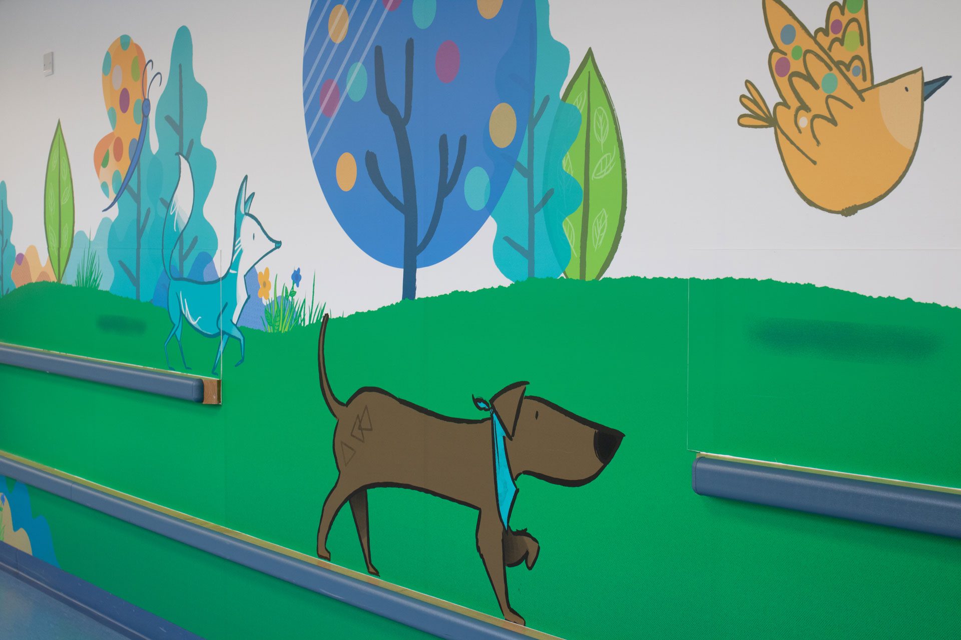
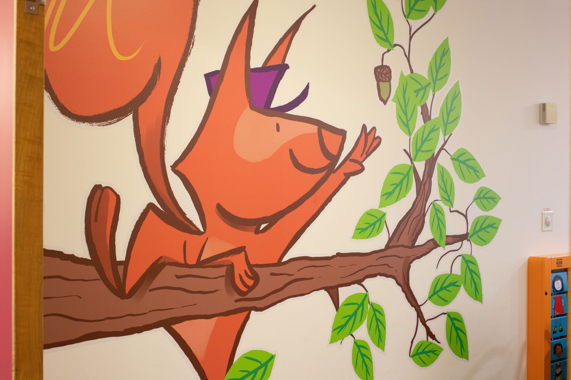
We took inspiration from the local natural beauty, from beach scenes to woodland picnics. We created hand-drawn and original illustrations that reflected what children and families might do when outside of the hospital.
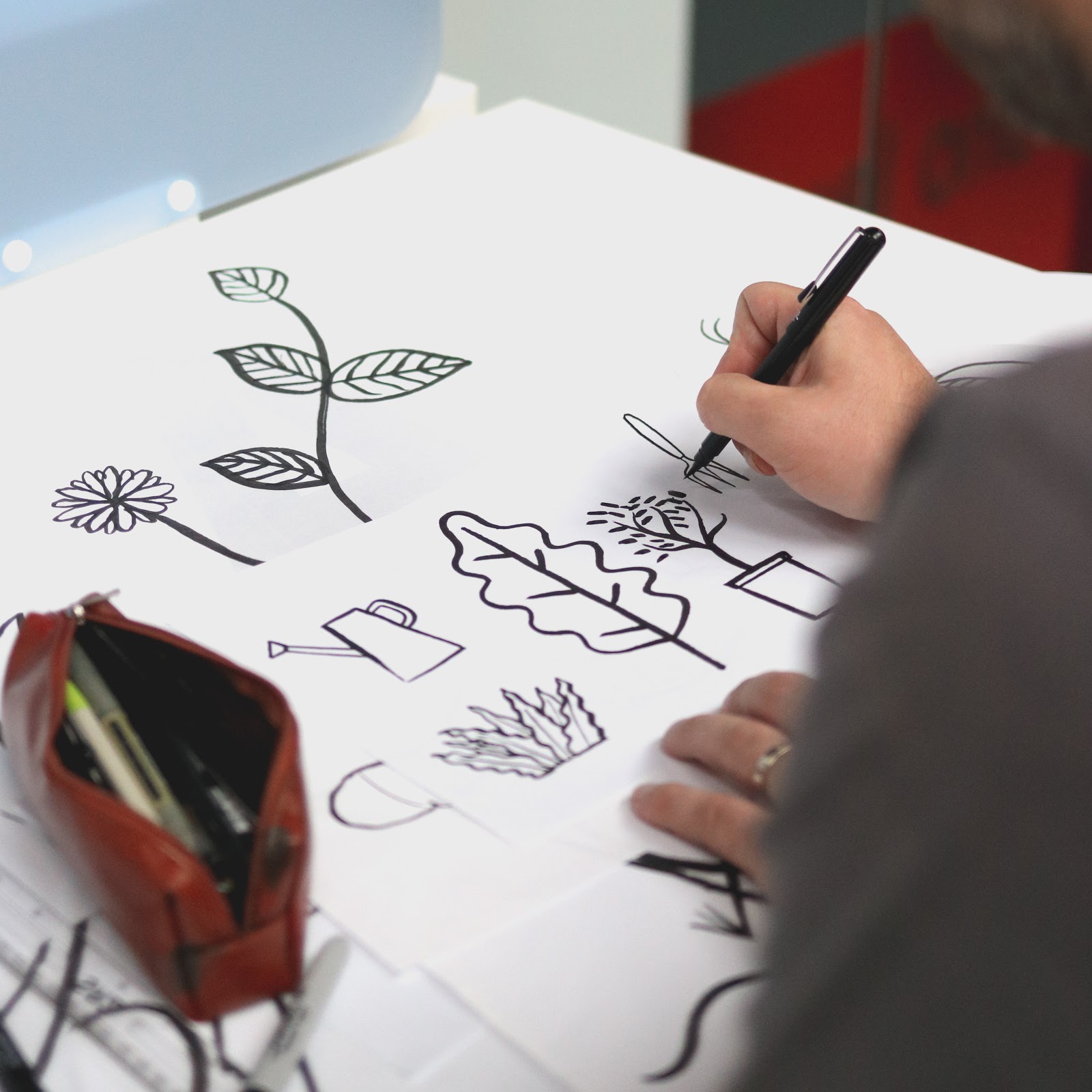
Working closely with the Ward Matrons, it was also clear that having characters that were familiar in day to day life was important rather than mystical creatures.
FINDING YOUR WAY
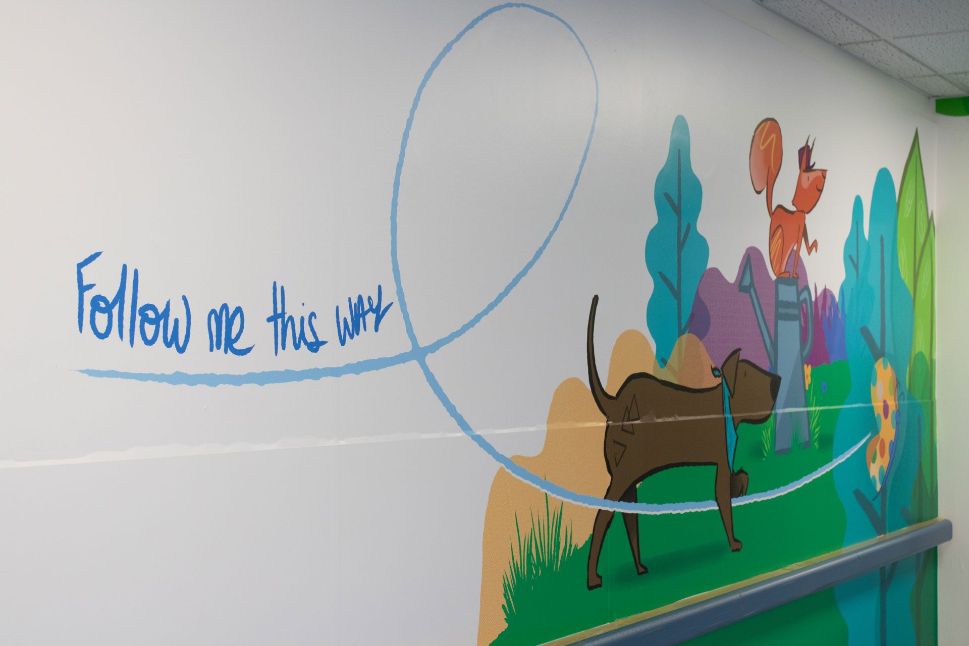
Wayfinding was another key element to the design brief. Two separate entrances and four wards created a challenge which was resolved by wall signage, floor stickers, use of colour and characters.
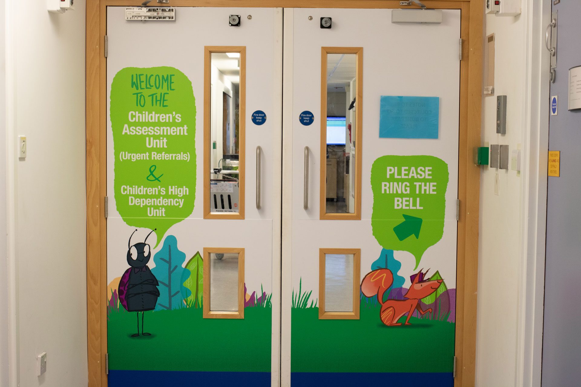
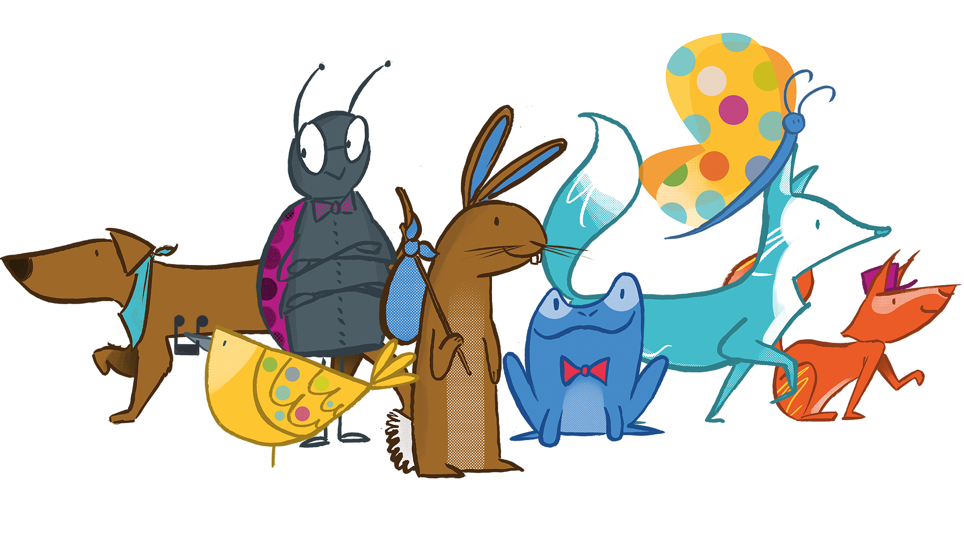
You meet all eight characters out in the corridor areas, where they begin their journey. Each of the four wards needed its own identity due to the various age ranges. Two characters were assigned to each ward along with two main colourways to aid wayfinding.
It was important to engage the children in the wayfinding too. Instead of focussing on why they are in hospital, they get to engage with fun and colourful characters and help find their own way around the hospital, following in their footsteps.
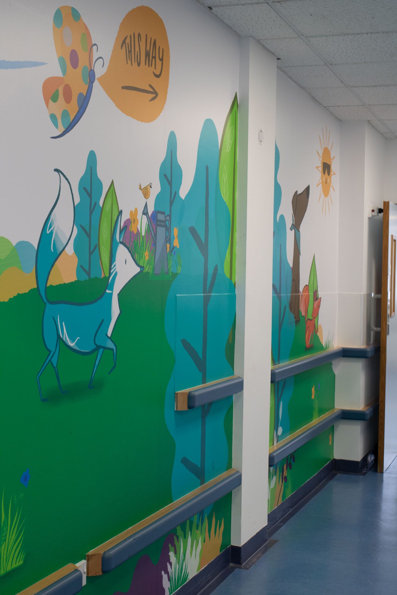
Working with a local architect company, we had a colour palette to work with which would help identify each ward along with two characters.
THE WARDS
Throughout each ward, the theme continues, providing a more welcoming, relaxed and fun environment for all. Some of the spaces were required to be vibrant and energetic, while other spaces needed to remain calm and relaxing, so colour was a key way of getting this across.
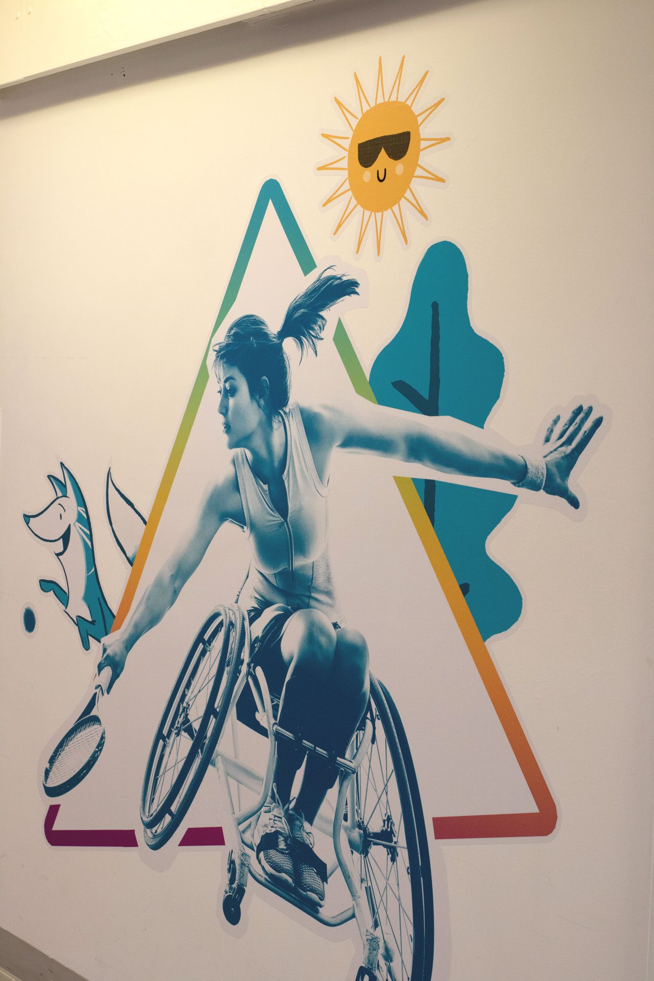
We also brought life to the waiting areas, playrooms, chillout zones, and bay areas. Each was tailored with the ward theme and characters, appealing to the specific age group in that ward.
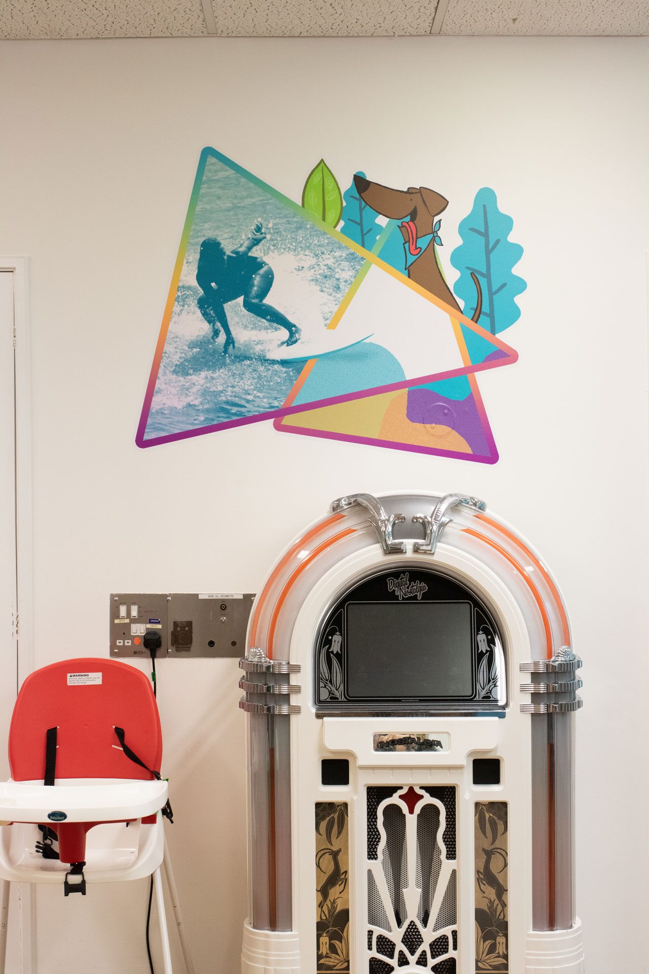
Quotes and words were used to further inspire and motivate patients and their families.
“Having been involved with Bluestone 360 over the last two years whilst working on the ‘Gold Dust appeal’ at University Hospitals Plymouth, I can honestly say it has been a very enjoyable and memorable experience. The team consisting of Neil Bennett and Pete Clayton, later joined by Amy Kyffin were a great team to work with. They really got on board and listened to our ideas and soon added many more of their own.
The brief we presented to Bluestone 360 was to make the children’s areas of level 12 at Derriford hospital more child friendly, this impacted on approximately 3000 square metres of space. This included an assessment ward, an out patients department, two wards and all circulation spaces. The theme of the project was called ‘Bringing the outside in’ and by adhering a variety of window, wall and floor graphics we did exactly this by using images of flowers, trees, meadows along with a collection of cheeky woodland animals which doubled up as way finders. This included a fox, squirrel, bird, butterfly, frog, rabbit to name but a few and the bright, fun, colourful graphics have really enhanced the space and we have certainly ticked the ‘more child friendly’ box.
Bluestone 360 were always approachable and open to more ideas, even change in some instances – but overall a great firm to work with.”
“It has been a pleasure to work with the team at Bluestone 360. From the very beginning, they were able to capture our vision for the area and make it a reality. The children are thrilled with the new design and characters, that capture our theme of ‘Bringing the outside in’. Thank you so much for helping us make such a difference to our environment.”