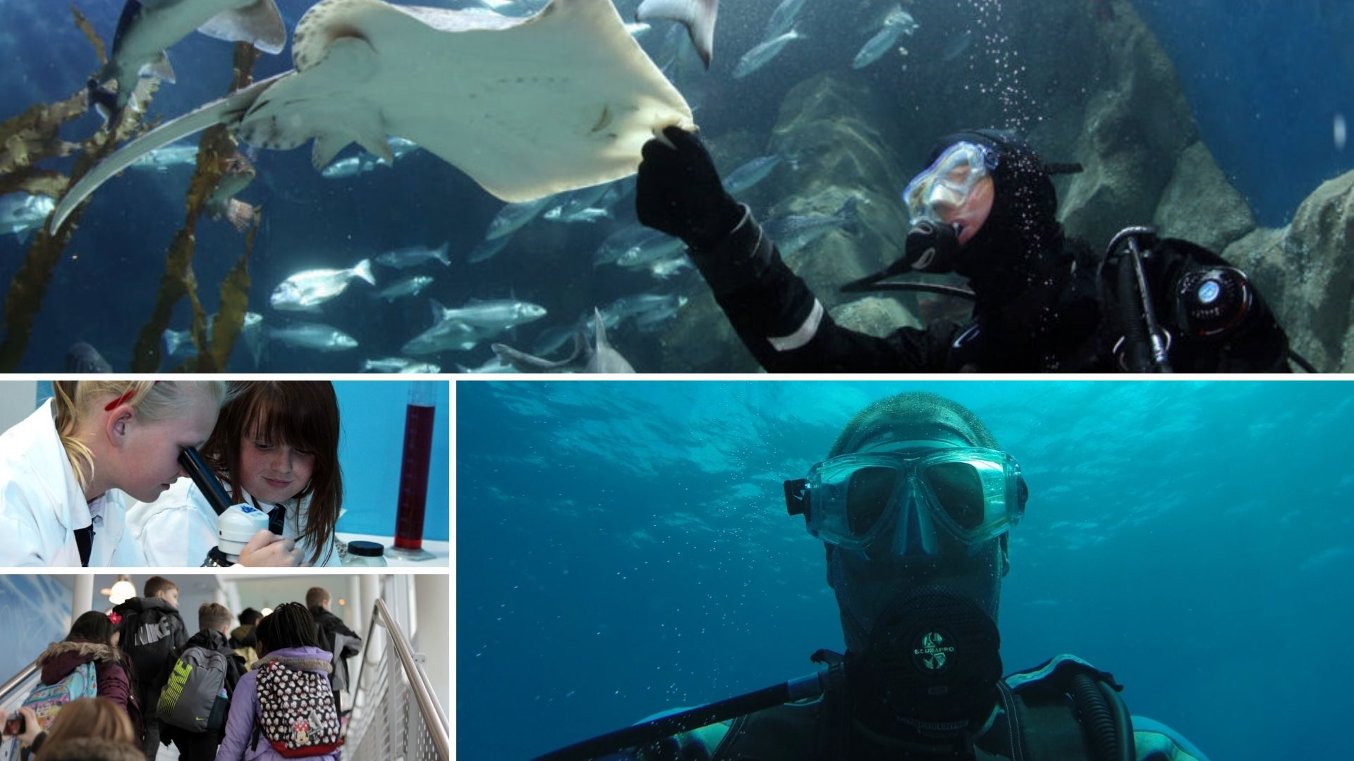
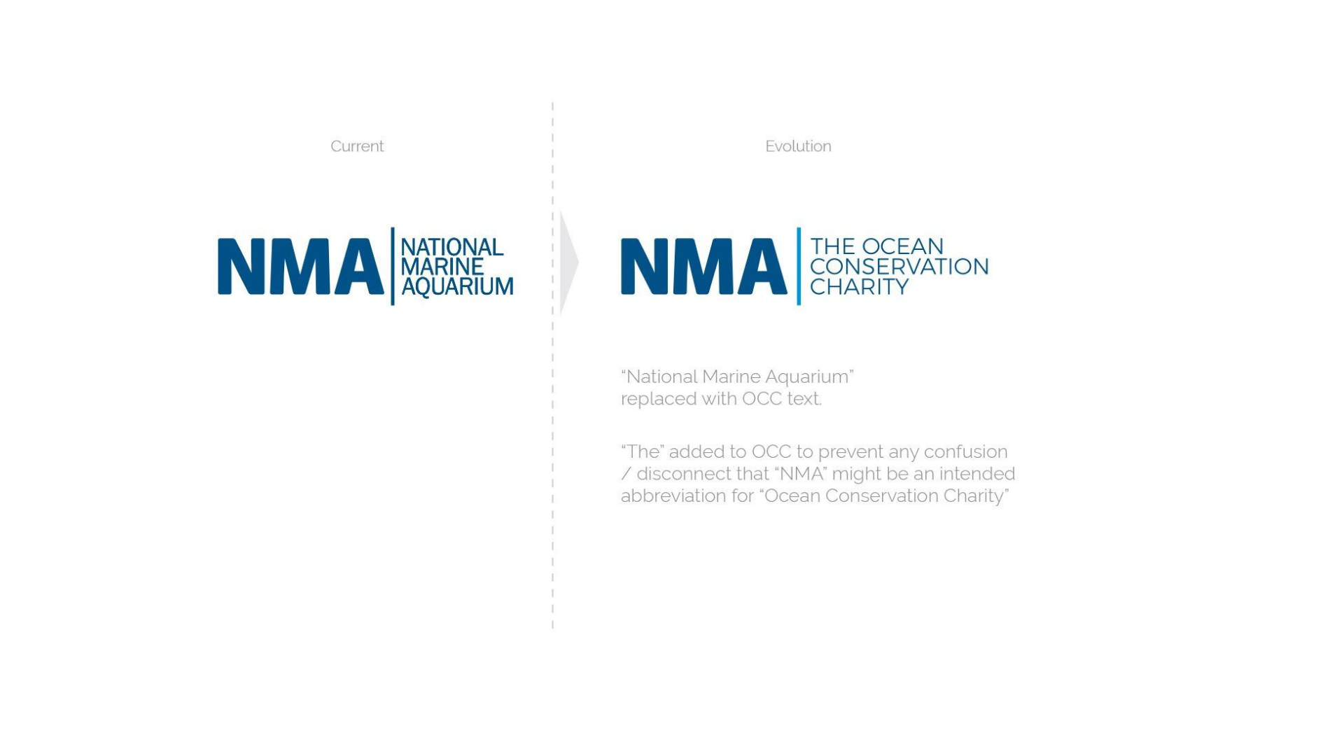
The Ocean Conservation Trust was born from the realisation that the work of the National Marine Aquarium (NMA) and its staff has always been more than just attracting visitors to look at fish.
Outside a very limited bubble of people, too few know the teams at the NMA have in-depth knowledge of ocean conservation, ocean science, husbandry, education and outreach programmes and are a charity that fosters ocean thinking to support positive actions to improve the environment.
DEEP THINKING FIRST
Working with the leadership team at the NMA it was agreed to differentiate between their charity status, conservation work and the aquarium to give greater emphasis to the work they do around ocean conservation to in turn give deeper meaning to the aquarium and support all the work they do.
The challenge was not as simple as a new logo. It would also require some fundamental changes to the structure and thinking of the current business model and the understanding that the Aquarium was a part of the overall brand and not the brand alone.
SHAPING THE STRATEGY
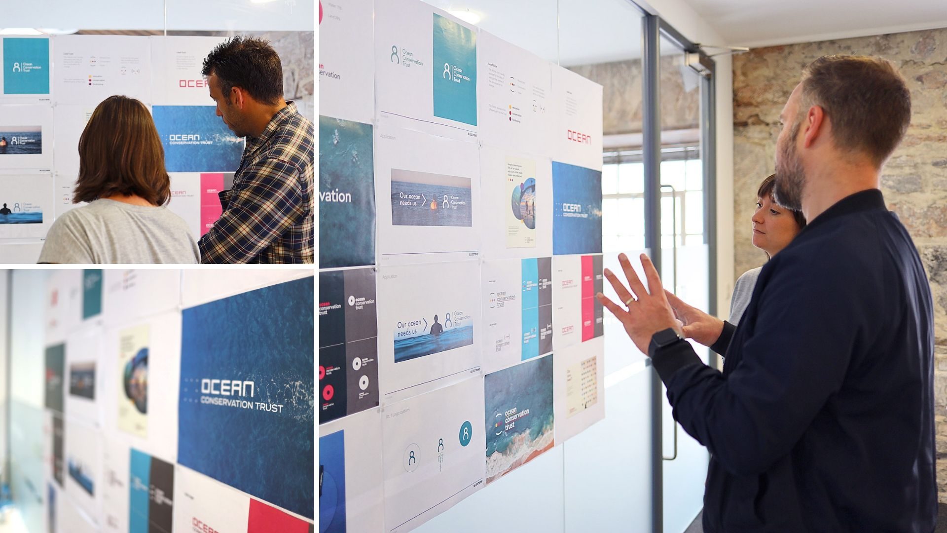
We worked closely with the team at the NMA to agree on brand hierarchy and positioning to emphasise how the charity and conservation work would look and feel and how the messaging would work.
Visualising and agreeing on the brand architecture, structure and hierarchy was key to defining a clear brand strategy to build the brand along with the clear related messaging and values of all the initiatives and sub-brands as needed.
Once the brand architecture was in place this allowed us to develop our thinking and approach for the new overarching brand including its name, function, positioning, values and ethos.
This led to the development of the final creative brief which would require various design concepts to be worked up in order to provide a spectrum of thinking how the brand would come alive from safe to sector breaking.
CHANNELLING THE CREATIVE
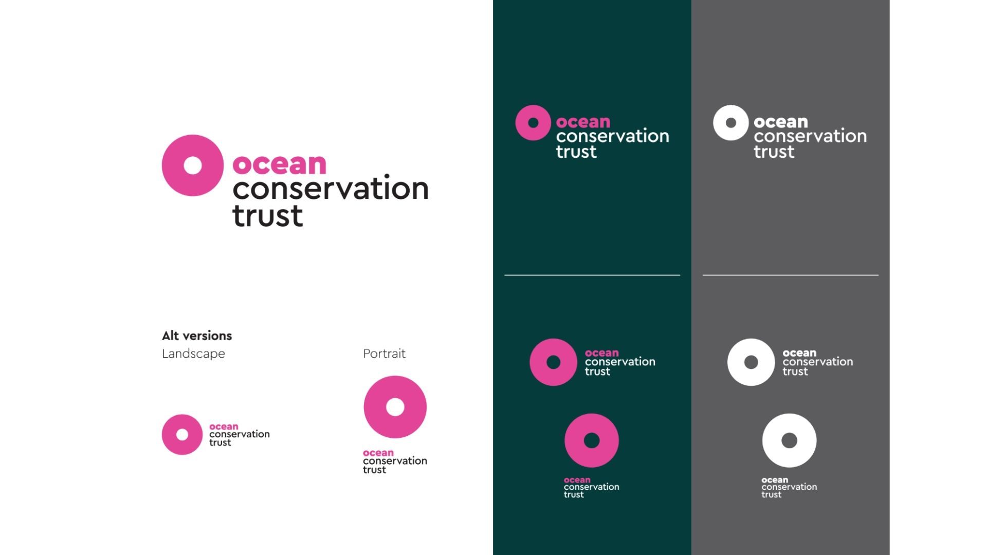
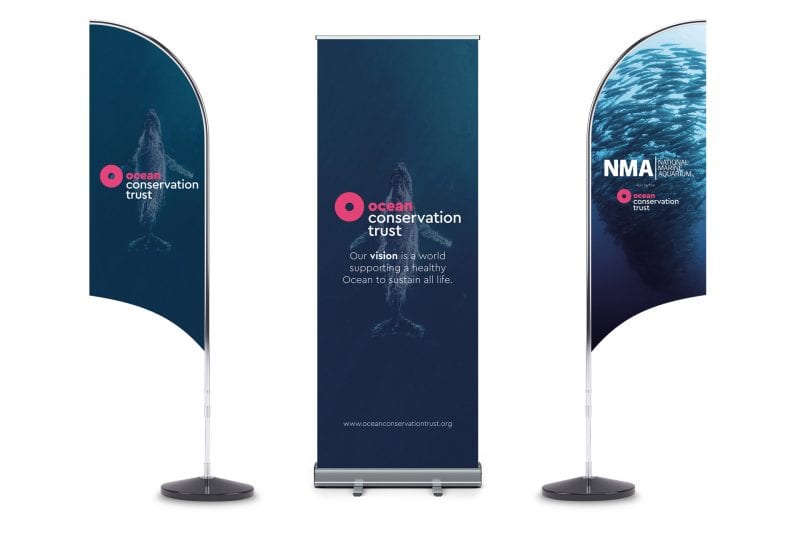
The newly named brand required a logo and brand language that needed to stand out from a crowded sector of blue logos to grab peoples attention to ‘think ocean’ and to inspire positive change.
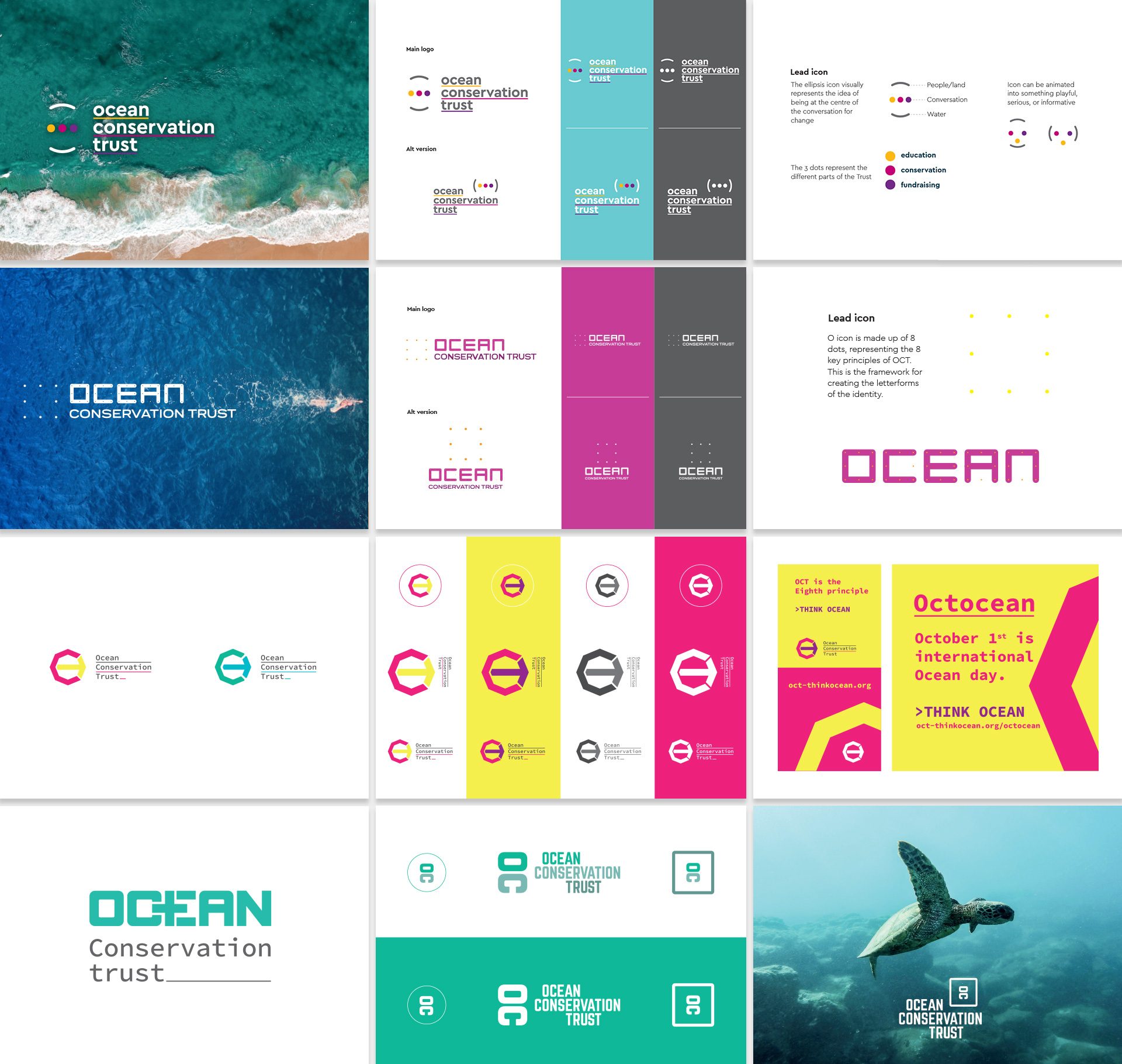
It had to appeal in a positive way to people and encompass the one ocean concept.
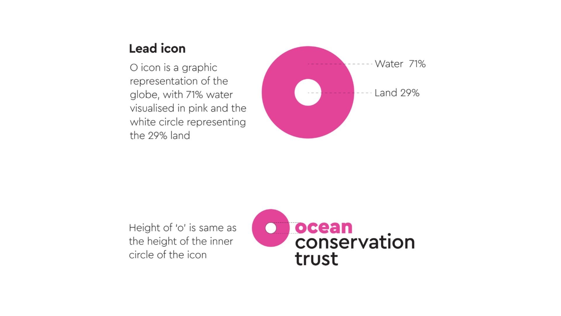
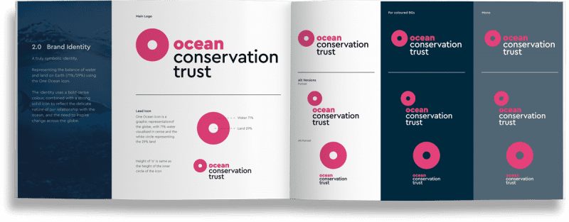
The chosen ID mark represents the balance of water and land by creating the one ocean icon. It is a graphic representation of the globe, with 71% water and the central circle representing the 29% land.
The identity uses a bold ruby pink colour to break away from sector expectations and to reflect the delicate nature of our relationship with the ocean, and the need to inspire change across the globe.
BRAND IMPLEMENTATION
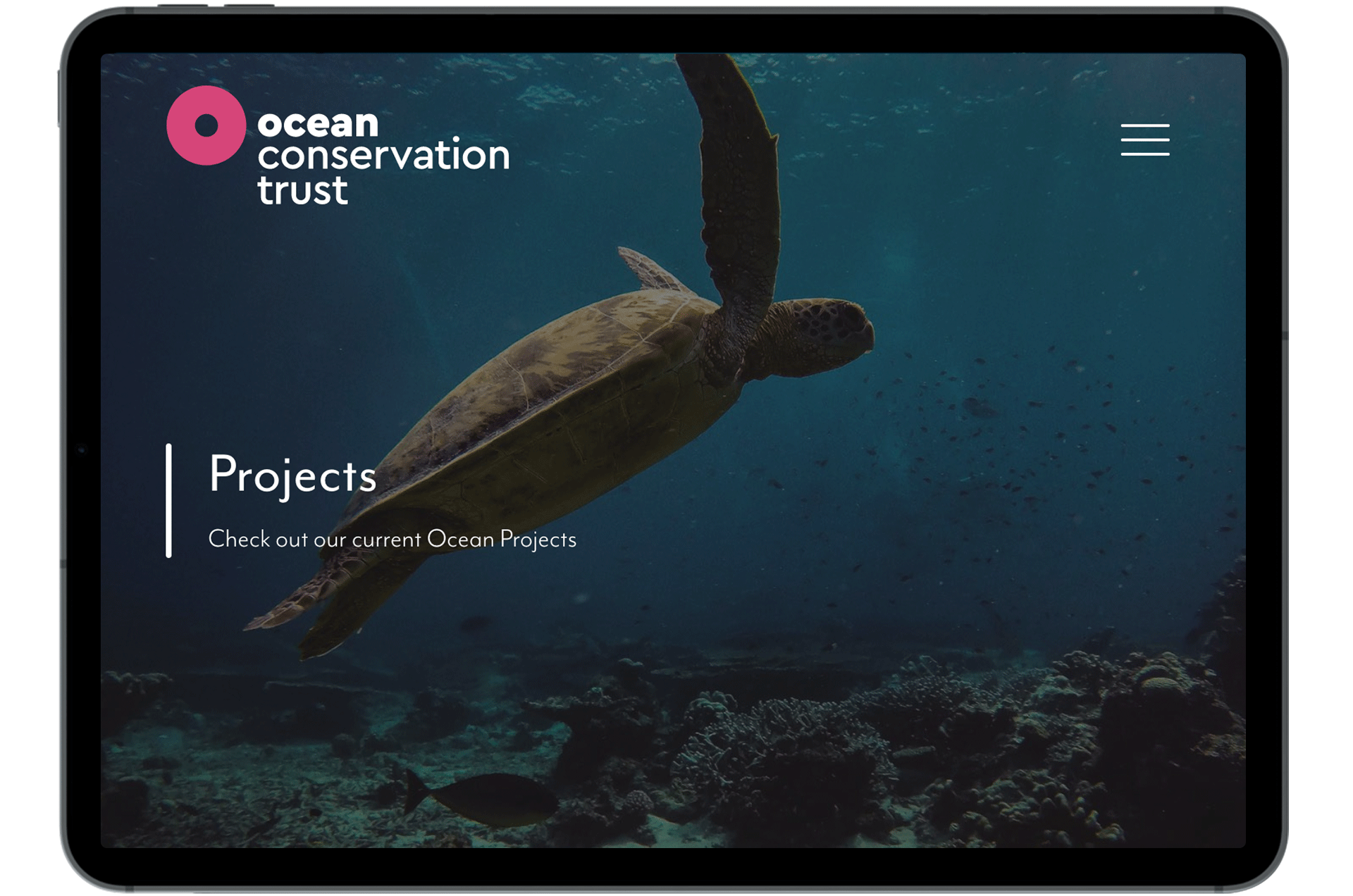
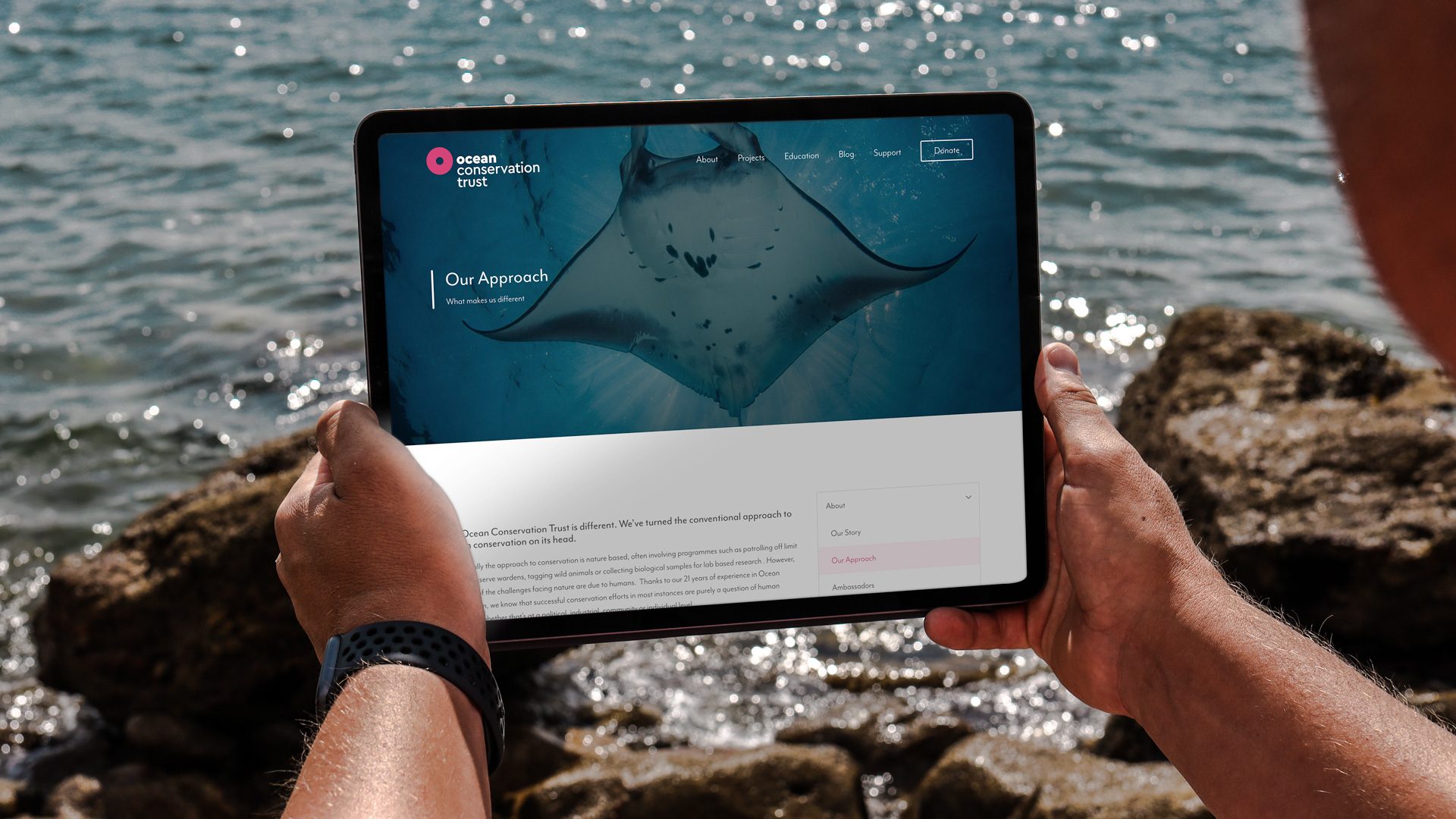
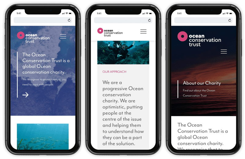
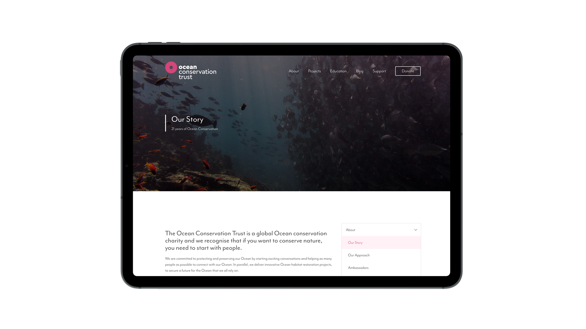
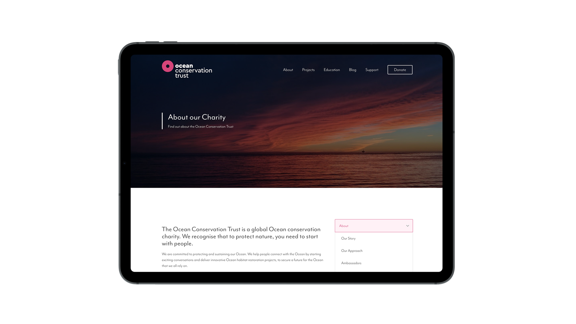
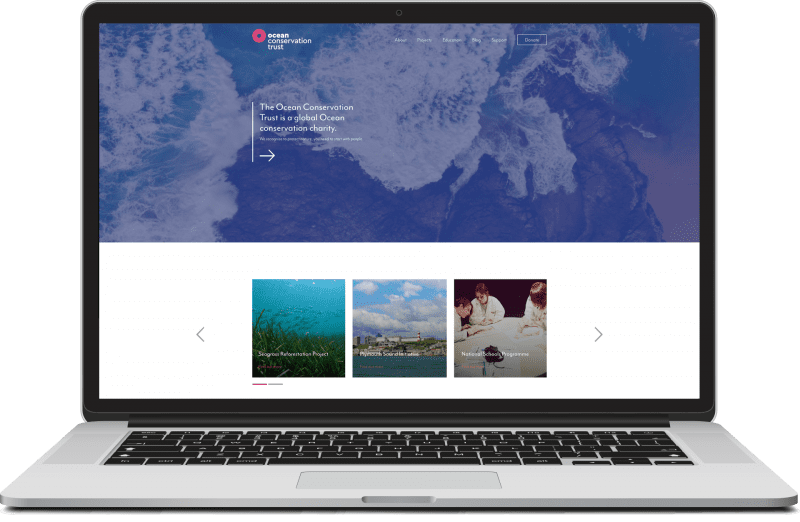
The new brand structure has been implemented across digital which included a restructure and new website build whilst maintaining the positioning of the NMA brand.
The website is a vital attraction that connects people with the ocean and clearly highlights the charity and conservation work.
The repositioning has led to…
- An increase of 2,000 followers on social platforms (launched with rebrand)
- A substantial increase in charitable donations received
- Facilitated relationships with social media influencers
- A positive response from ambassadors, grant projects and other project partners
- An increased media profile nationally – appeared on BBC Breakfast and BBC Radio 2 as well as in London Evening Standard
It has been a pleasure to work with Bluestone on coming up with a brand concept for the Ocean Conservation Trust. In an exciting time of much change, their creative team really listened to what we wanted and came up with something that is both meaningful and tells an important story about what it is that we represent. Not only that, but they have also helped us to stand out in an industry that is filled with brand logos in blues and greens – creating us a unique ID mark that is symbolic of our unique approach to conservation.
They have provided us with a clear brand strategy and helped us to understand how our brand hierarchy will work, too. There are lots of elements to what we do at the Ocean Conservation Trust, and Bluestone have helped us to package and represent each of them in a way that is consistent and easily recognisable, whilst allowing each to stand out in its own right.