CL Medilaw are a specialist Brain Injury and Clinical Negligence law firm working with clients and their families to get the support, answers and compensation that they deserve.
As part of a large national corporate organisation, it was clear the brand did not align with their values, proposition, positioning and audiences.
UNCOVERING CORE VALUES
After undertaking a BrandDNA and creating their brand wheel, along with stakeholder interviews, we got to know the sector, their ambitions and audiences in more depth which revealed a clear core value: for them to be seen as a company that puts clients first.
Working with the new brand wheel, insights and core values we created a brand and visual identity that appealed to their audience – everyday people and their families who need professional solicitor support.
A key requirement was that it had to look ‘nothing like’ a law firm but more of a caring and approachable support organisation.
CHANGING LIVES
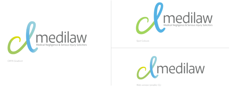
What resulted from the creative phases and concepts was an energetic, enthusiastic and friendly identity whilst still retaining the sense of trust and (legal) high standards of professionalism.
‘CL’ stands for ‘Changing Lives’ which is so much a part of what they do. Also, ‘CL’ can sometimes be seen as an abbreviation of the word clients, and so the brand name and ID mark helps to emphasise that their clients always come first.
VISUAL BRAND LANGUAGE
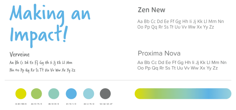
As part of the creative and brand identity development phases, we started to create the broader visual brand language using the outcomes of the BrandDNA to guide us. Using a mixture of soft colours, emotive imagery and illustrations help to showcase a friendly but experienced brand.
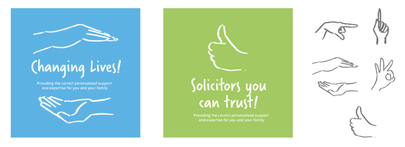

A considered approach to the use of photography was explored to illustrate the positive touch of CL Medilaw. The logo aesthetic has been brought to life in the form of illustrations. It ‘interacts’ with the photography showing how CL Medilaw are always part of the journey with the client.

A WEBSITE TO MATCH
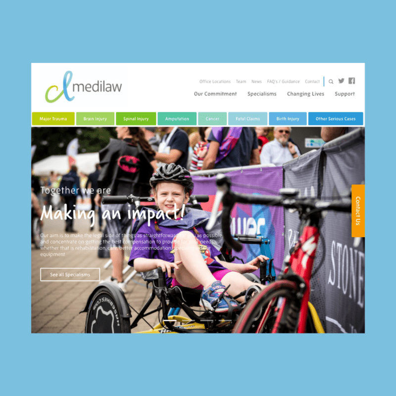
The website not only needed to reflect the brand and visual language – friendly, human and professional – but it also needed to have the user in mind at all times, guiding them throughout the site and helping them to find the information they required quickly.
We reviewed the audience profiles, goals and objectives and mapped out the user journeys and customer experience specific to the website to build a functional specification that aligned with the brand.
The digital team worked closely with the designers, working through the various stages from wireframes through to the build of the dev site allowing for CMS training and content population as part of the process.

Photography and videography are used throughout to help tell those important stories and humanise the brand.
It has been a pleasure to work with the team at Bluestone360. Our journey with them began with a concept and ended with a fantastic brand, a wealth of creative design and a website that we are extremely proud of.
What really made the difference was their team’s ability to understand us, our sector and the look and feel that we wanted to create for our clients and their communities. This is a difficult task in a sector where compassion and sensitivity are key and where tone is so important. They just ‘got it’ from the start and I would be happy to recommend them.
