The Higgidy story began when Camilla Stephens, their co-founder, spotted a gap in the market to deliver delicious, wholesome pies to our plates. With a lifelong love of cooking, she has been working in the Higgidy kitchen ever since with her dedicated team.
They wanted a website re-design and build, with their primary goals to increase brand awareness, have a consistent plan for digital with the website at the heart and drive consumer engagement and sales.
A WEBSITE TO DEMONSTRATE THE ETHOS
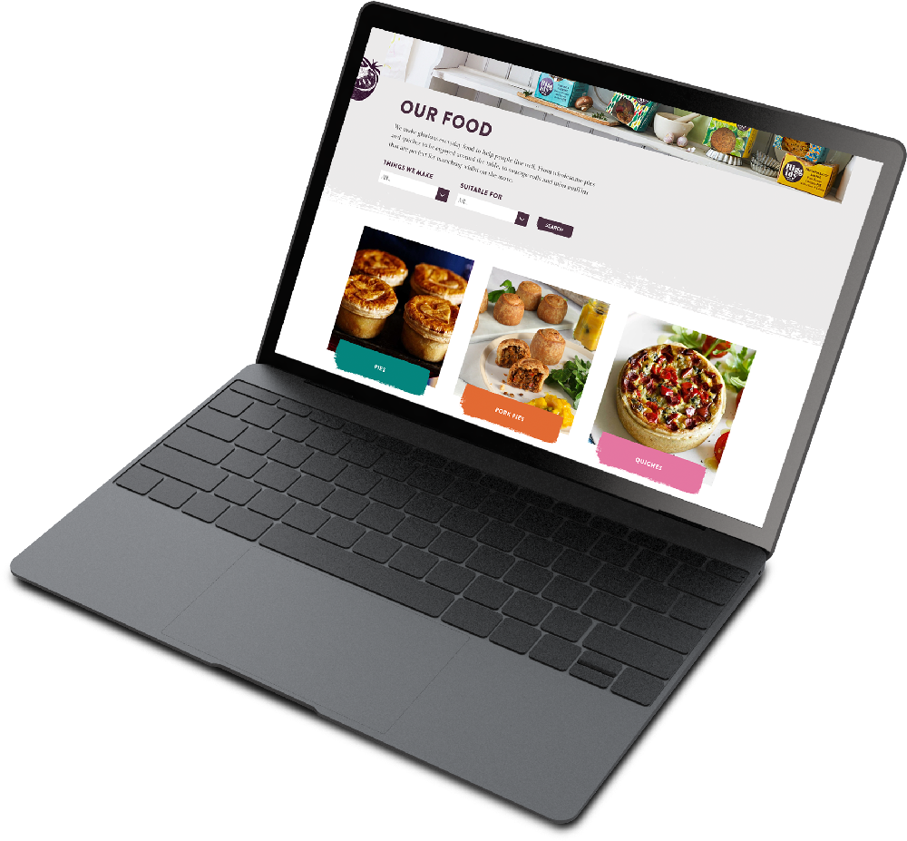
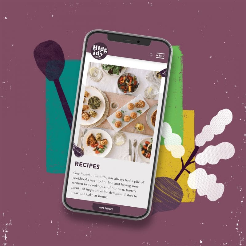
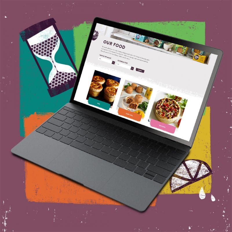
Their decadent patterns sit across a large range of products to represent their glorious everyday food. However, their previous site hid these patterns in favour of the purple colour. Simplifying these visuals on the customer journey would create a better experience and allow their tone of voice to be more defined. This journey would also be helped with more clearly defined sections, creating a hierarchy of content.
Their old site map was fit for purpose but some improvements were made to enhance it further, so that it is truly robust. With the current rich selection of content featuring on the site, it gave us a platform to build a fresh, intuitive website. We felt that taste and variety were a key focus for the brand, so we really wanted consumers to experience the taste virtually (without eating their computers…).
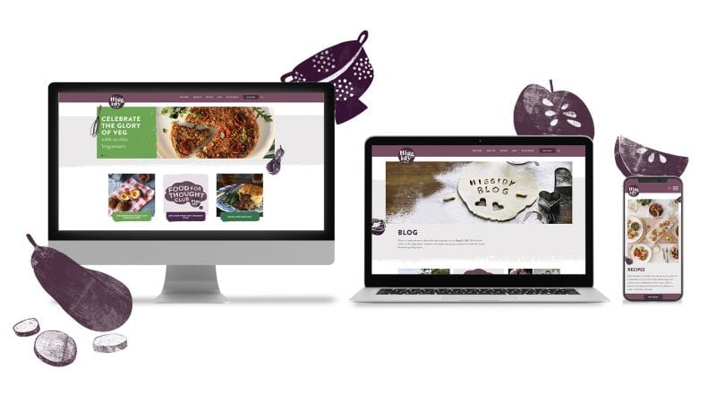
With a strong brand already in place, we needed the new website to highlight the key point of difference of the brand at an emotional rather than practical level – why Higgidy really do taste better. The website now possesses this rich visual brand language to greater effect in order to promote brand consistency. The Higgidy tone of voice, ethos and most important key messages about taste and variety really shine through.
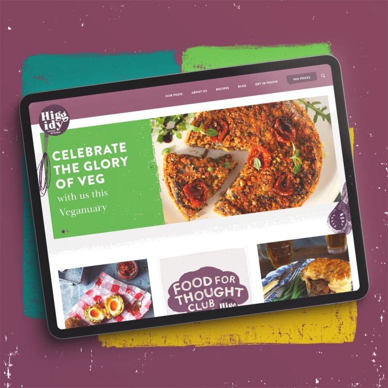
Another core goal was to help drive consumer sales. This was much more than linking to supermarket sites – it was how to become more visible online, simplifying the customer experience, having better integration with social media, better visibility of products, clearer promotions and driving consumer engagements throughout key times of the year.
DEFINING USER JOURNEY
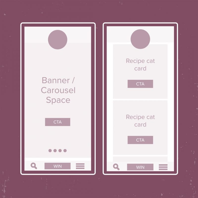
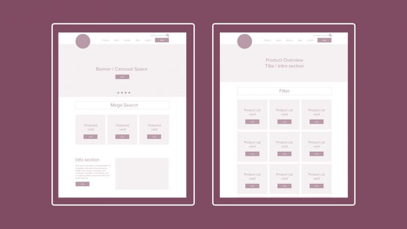
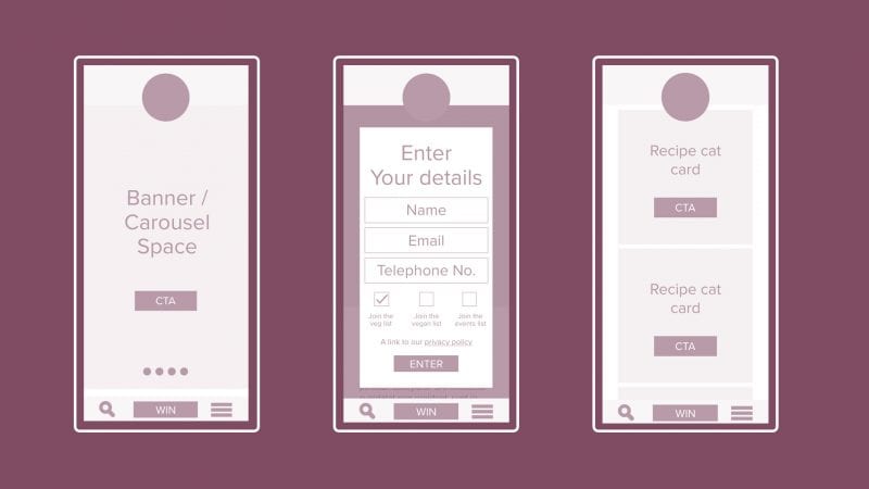
It was important to understand the journey of their consumers so we could best design and build a website that was fit for purpose. We created wireframes to efficiently define the layout and elements of key pages before developing them further.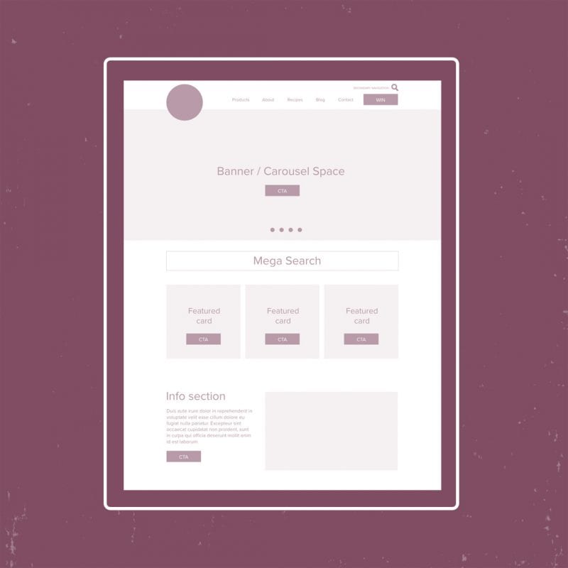
INCREASING BRAND AWARENESS
As one of the primary goals for this project was to increase brand awareness and define a digital strategy where the website was the heart, we provided SEO and PPC training so that Higgidy had the skills internally. We set up Analytics Dashboard in order to share data visibility across the company. Also, we performed a GAP Analysis against their competitors to see where they sat within the marketplace and identify any potential opportunities.
The team at Bluestone360 have completely refreshed and rejuvenated the Higgidy website and it’s the best it’s ever been – both visually and from a consumer journey perspective. We’re seeing consumers spending more time exploring the website and discovering what Higgidy has to offer.
The team were thoroughly enjoyable to work with and interpreted our brief perfectly, suggesting innovative ideas and adopting our brand identity with ease. They managed to turn the new site around in record time over the Christmas period, responding to queries in a timely manner and ensuring that our team were fully up to speed on the CMS so that we can easily implement changes ourselves.

