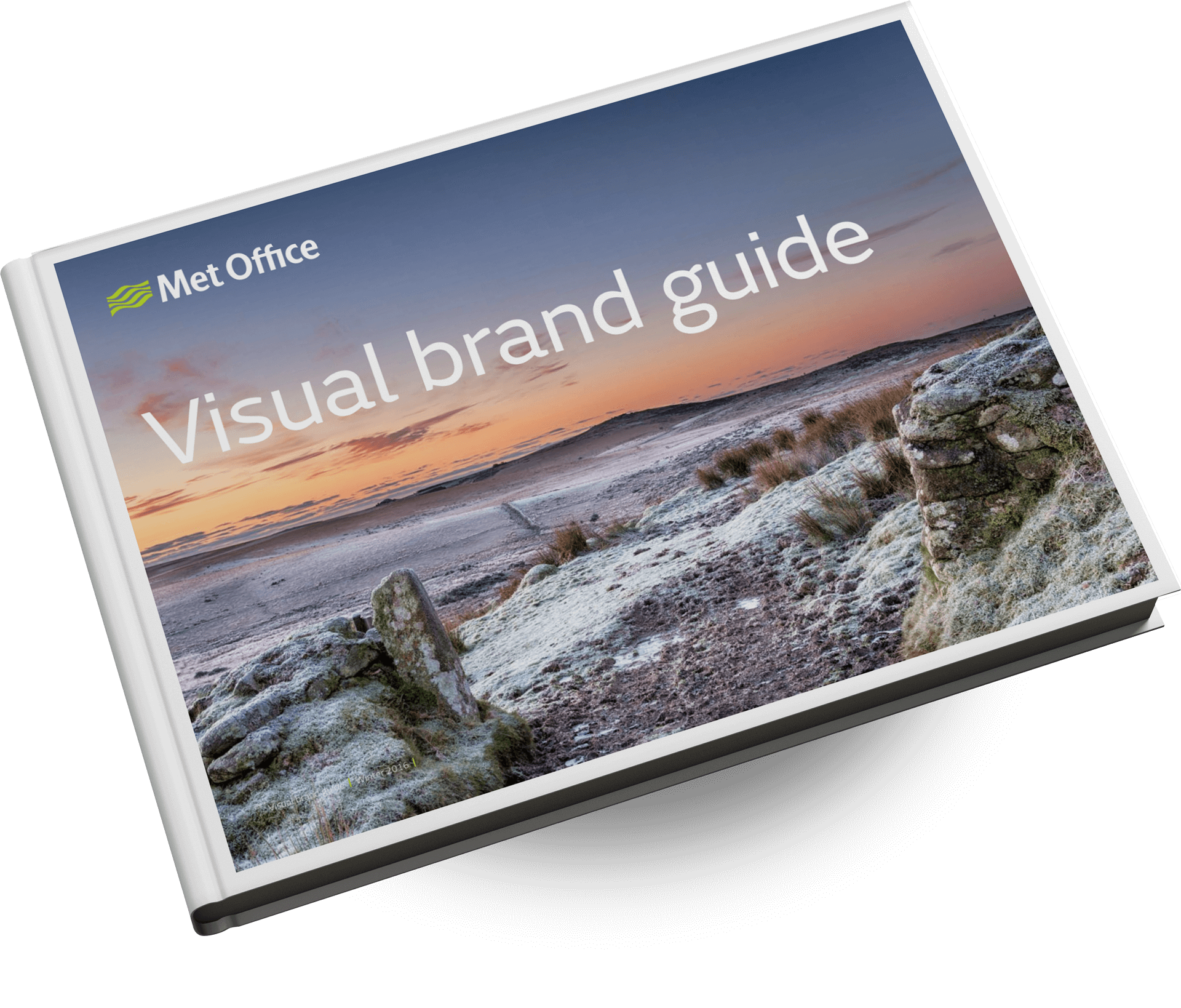
Established in 1854, The Met Office is the UK’s national weather service and is at the forefront of research into weather and climate change. Despite having built a reputation of trust, employees thought their brand looked ‘tired’ and did not reflect their positioning at the cutting edge of weather and climate science.
WORKING WITH THE TEAM
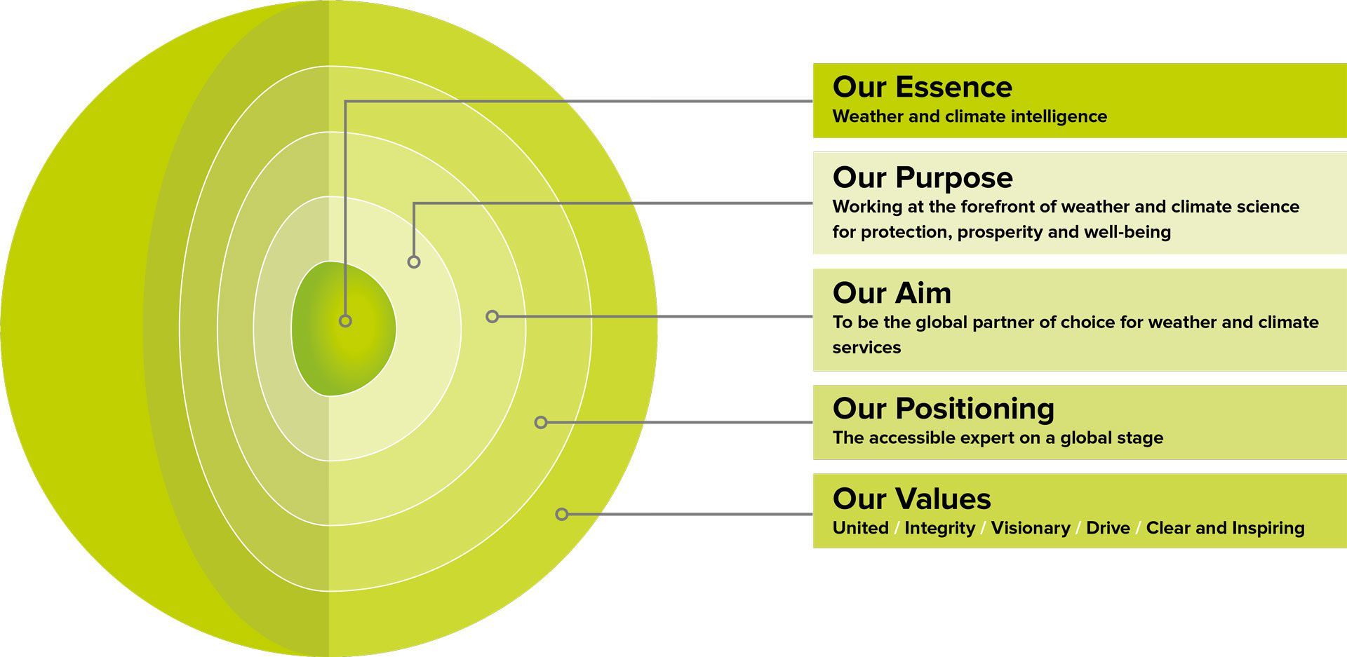
The Met Office team wanted a modern visual brand that reflected their purpose of protection, prosperity, and well-being, and they needed brand guidelines that were clear enough to provide consistency, but flexible enough to use across their growing list of channels – both print and online.
It’s not easy for employees to adjust to a complete brand overhaul. That’s why we worked closely with a small team from the Met Office at every step of the process. Together, we helped staff understand that we were creating an even stronger brand. The modern look and feel would honour the institution’s proud history while signalling it was more than capable of leading well into the future.
We wanted to get to the heart of the issue, so we held interviews with more than 30 people across the organisation. This included everyone from the chief executive to scientists, researchers, and the digital team. We also undertook a brand audit to see what they were publishing and understand what needed to change. We analysed everything from their social media channels to video content, reports, and even the posters in the office.
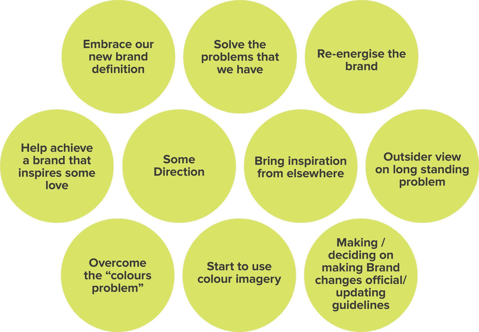
We discovered the old brand guidelines were so rigid, employees felt they had no choice but to come up with their own interpretations. This led to serious inconsistencies and defeated the point of having a brand.
CREATING A CLEAR TONE OF VOICE
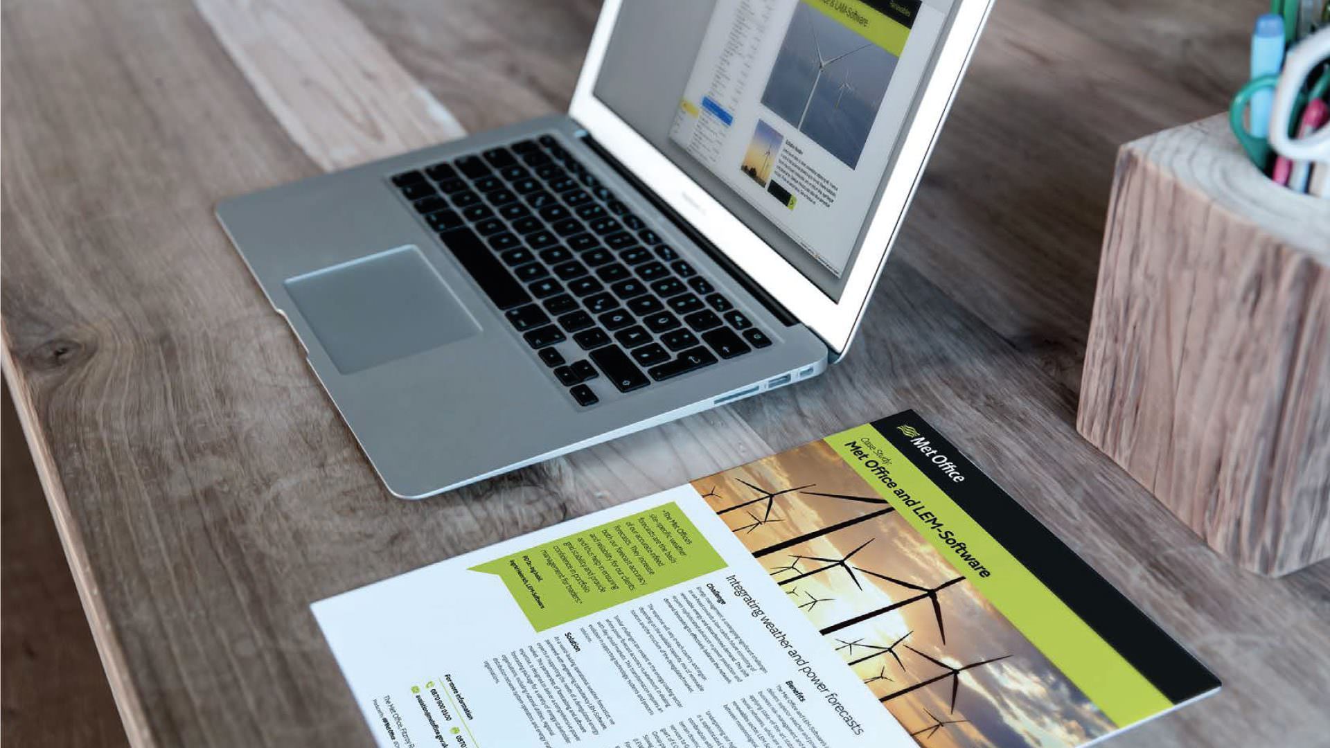
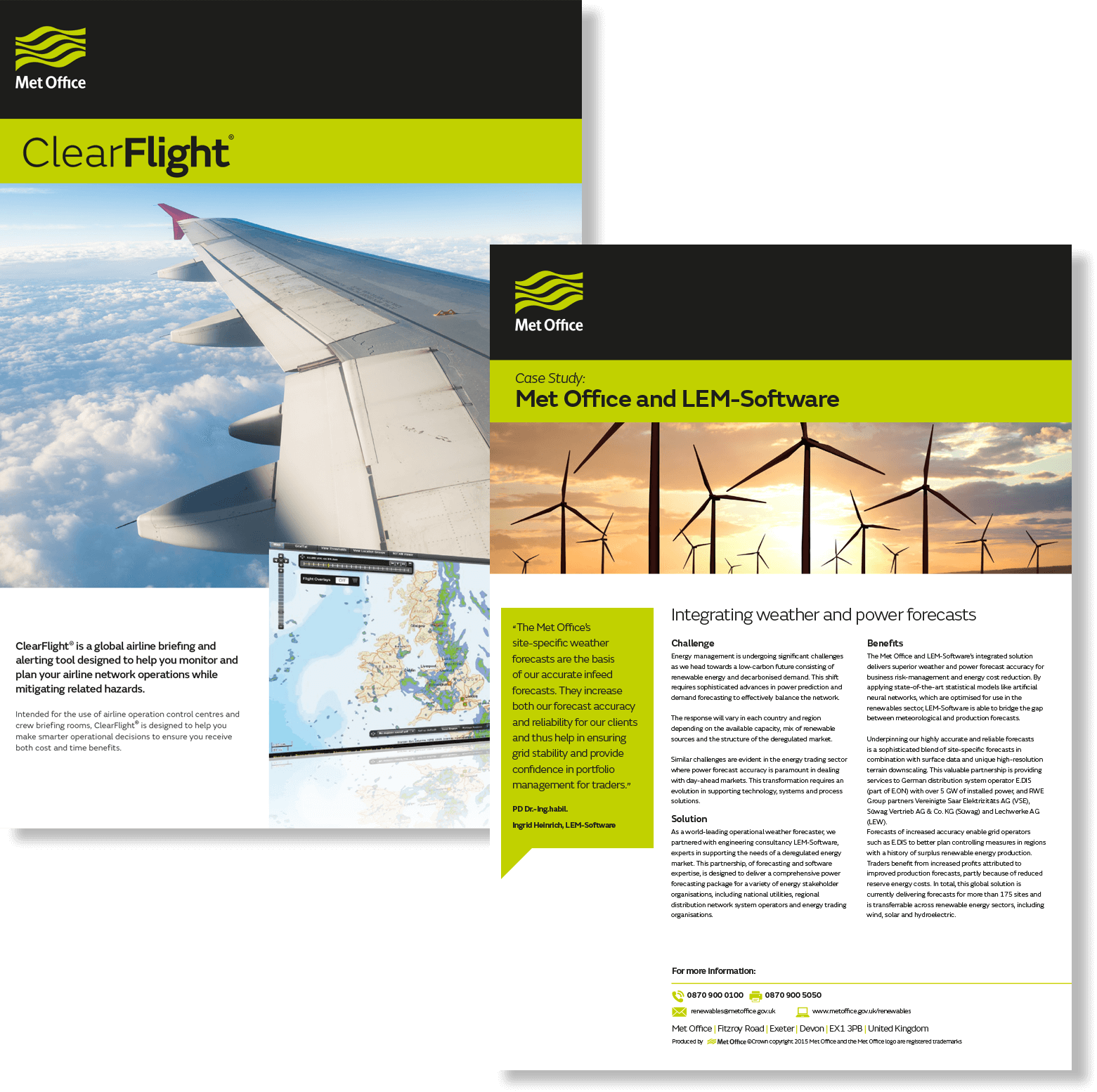
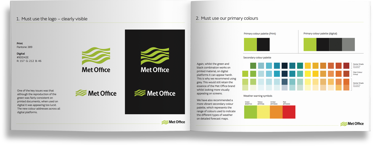
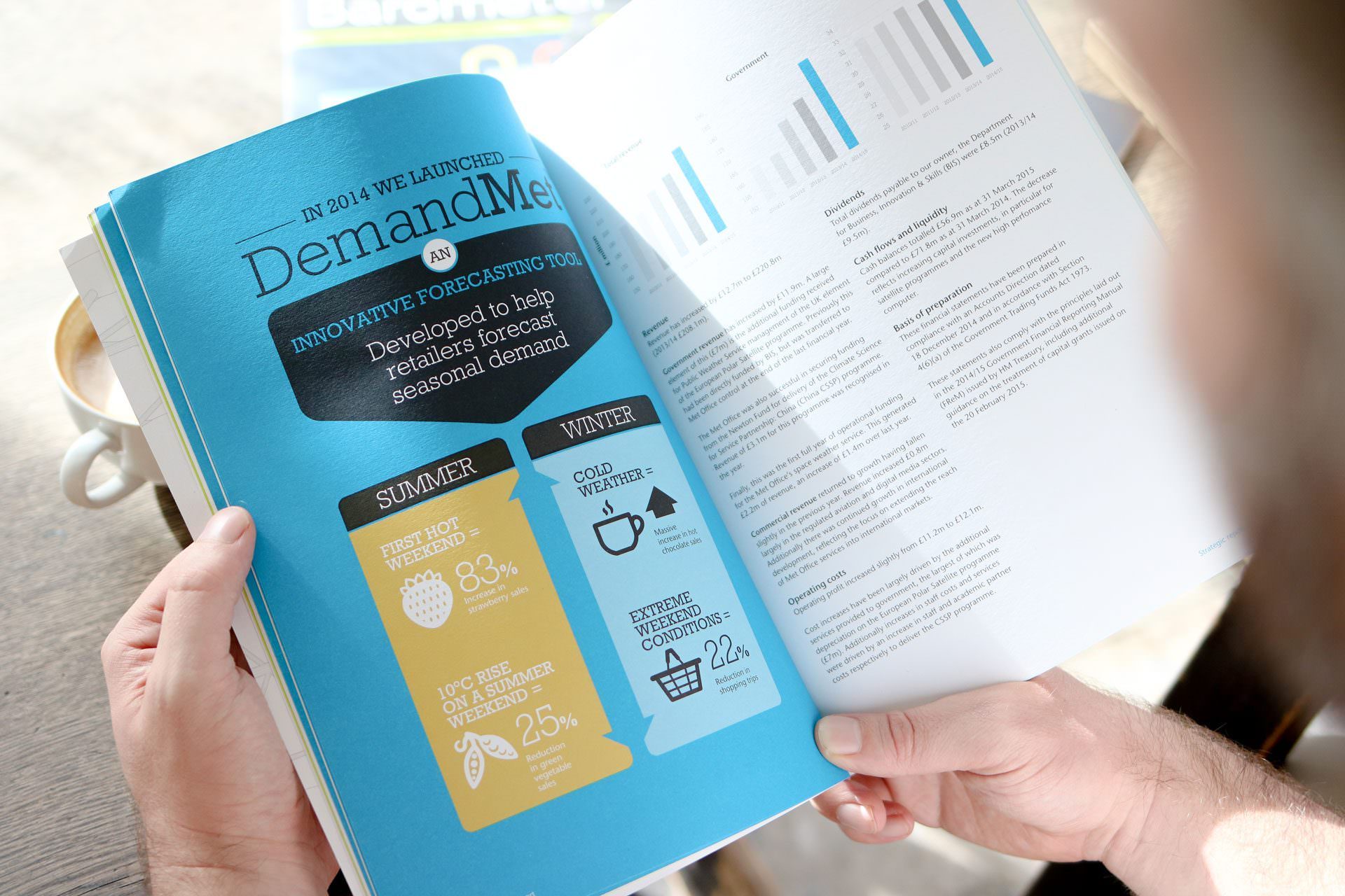
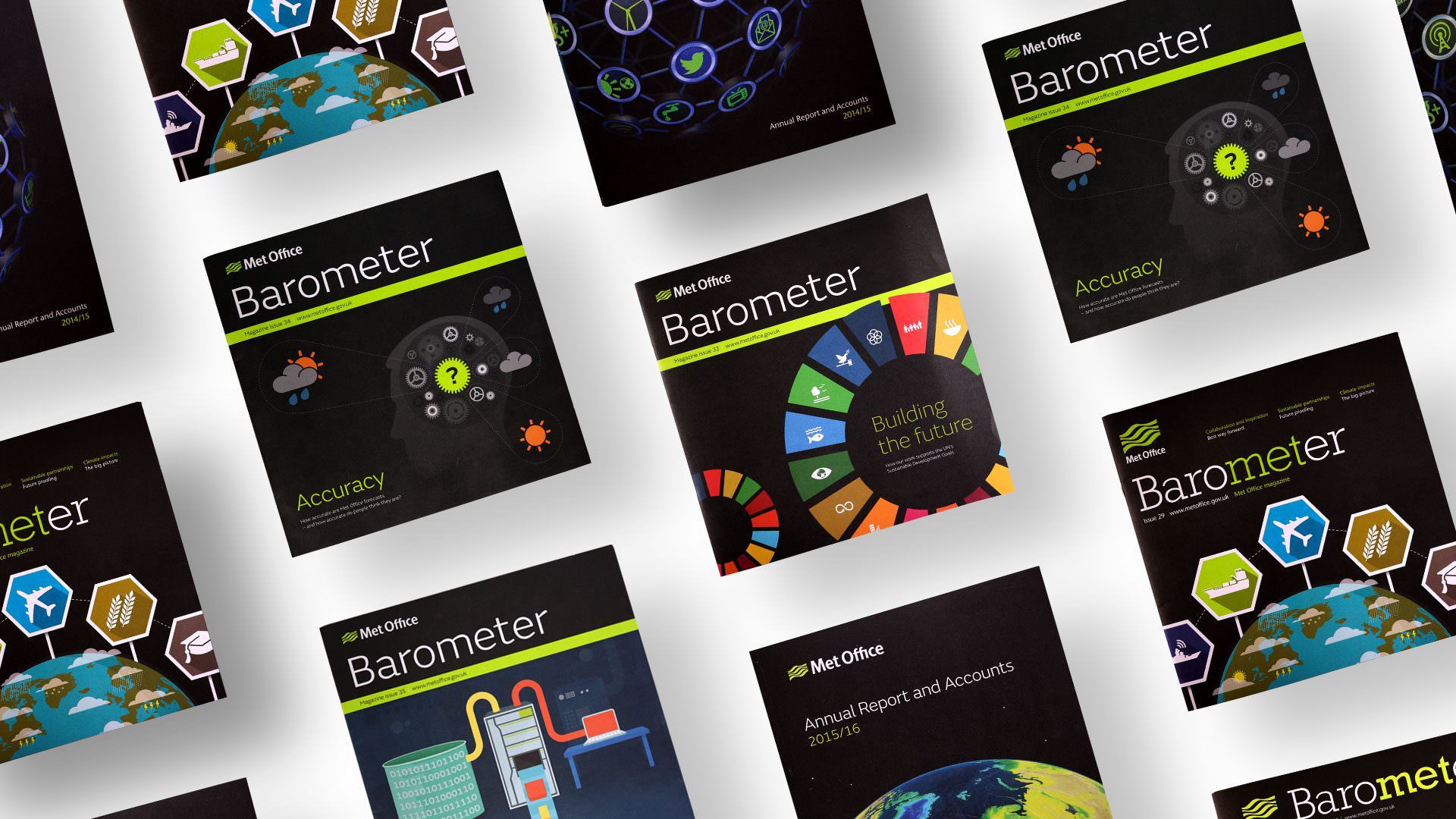
The solution was to introduce all-new brand guidelines that actually worked. We gave them a fresh colour palette and font, a clear tone of voice, and guidance on how to use the logo. We also had a checklist to decide which images were best, and how to use the all-important weather icons. It was more than just a set of rules. It was permission to be bold and authoritative in a consistent way – always reflecting the Met Office’s mission.
UNIFYING EFFECT OF A BRAND
Senior leaders said that as a result, staff took far more pride in the brand. The unified look and feel helped departments feel more unified, too. Feedback showed that the Met Office enjoyed an even better public perception of being a trustworthy, engaging organisation.
“We’ve worked with Bluestone for a number of years on a variety of different projects – from visual brand through to editorial work. The great thing is they are happy to adapt and work with us differently depending on the project. That might mean sometimes we use them as an extension of the Design Team and have them in on idea generation sessions, or that we simply provide them with a brief and leave them to work their magic.
I’ve been especially impressed by their work with our corporate magazine, Barometer, which they help manage and produce to very tight deadlines. Always delivering on time, they can absolutely be relied upon to create quality creatives.”